Titan smart

Cross-functional partners
Engineering, Sales, Business Development, Product managers, Copywriters, Executives.
Creating a mobile application for India's first fully made-in-India smartwatch
Titan Smart
As a UX design intern at Titan Company, I designed five new health features (onboarding, SpO2, VO2 max, stress and women's health) for the app of India's first fully made-in-India smartwatch. All of them shipped.
Worked with: Engineering, Sales, Business Development, Product managers, Copywriters and Executives.
Titan Smart: health features for India’s first fully made-in-India smartwatch
ResultDesigned 5 new health features (onboarding, SpO2, VO2 max, stress, women’s health) that shipped in the Titan Smart app.
The problem
Titan was launching its first fully made-in-India smartwatch and needed brand-new health features designed from scratch, inside an app already in progress.
What I did
- Owned UI and UX for onboarding, SpO2, VO2 max, stress and women’s health
- Ran user research and usability tests, then fixed the pain points they surfaced
- Created every new design asset and fit the features into the existing architecture
An app for India’s first fully made-in-India smartwatch
Titan, a leading Indian lifestyle brand and the country’s fifth-largest watch maker, was launching its first fully made-in-India smartwatch. I joined the team midway through the project.
I designed the UI and UX for onboarding, SpO2, VO2 max, stress and women’s health.
- More efficient use, and higher engagement
- Customer satisfaction and retention
- Lower engineering costs
Five features, designed from scratch
None of these features existed before, so I owned the user research, every new design asset and the usability testing.
No ‘before’ here.
These features didn’t exist until I designed them.
- No onboarding for the new watch
- No SpO2, VO2 max or stress views
- No women’s health section
to a full
health app
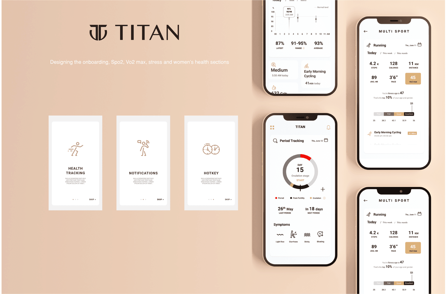
- Onboarding, SpO2, VO2 max, stress and women’s health
- Fitted into the app’s existing architecture
- Women’s health added as a whole new section
Fitting new features into an existing app
The new features had to slot into the app’s existing architecture, while women’s health needed a structure of its own.
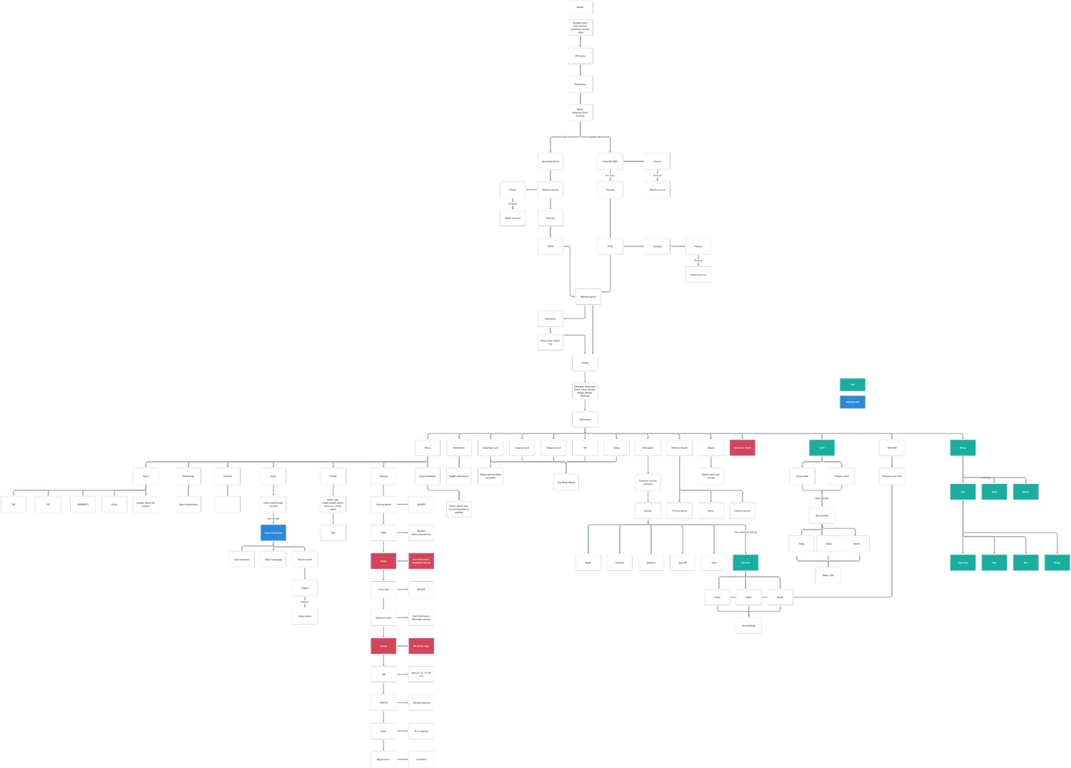
The whole app. Onboarding and the new health features, fitted into the existing architecture.
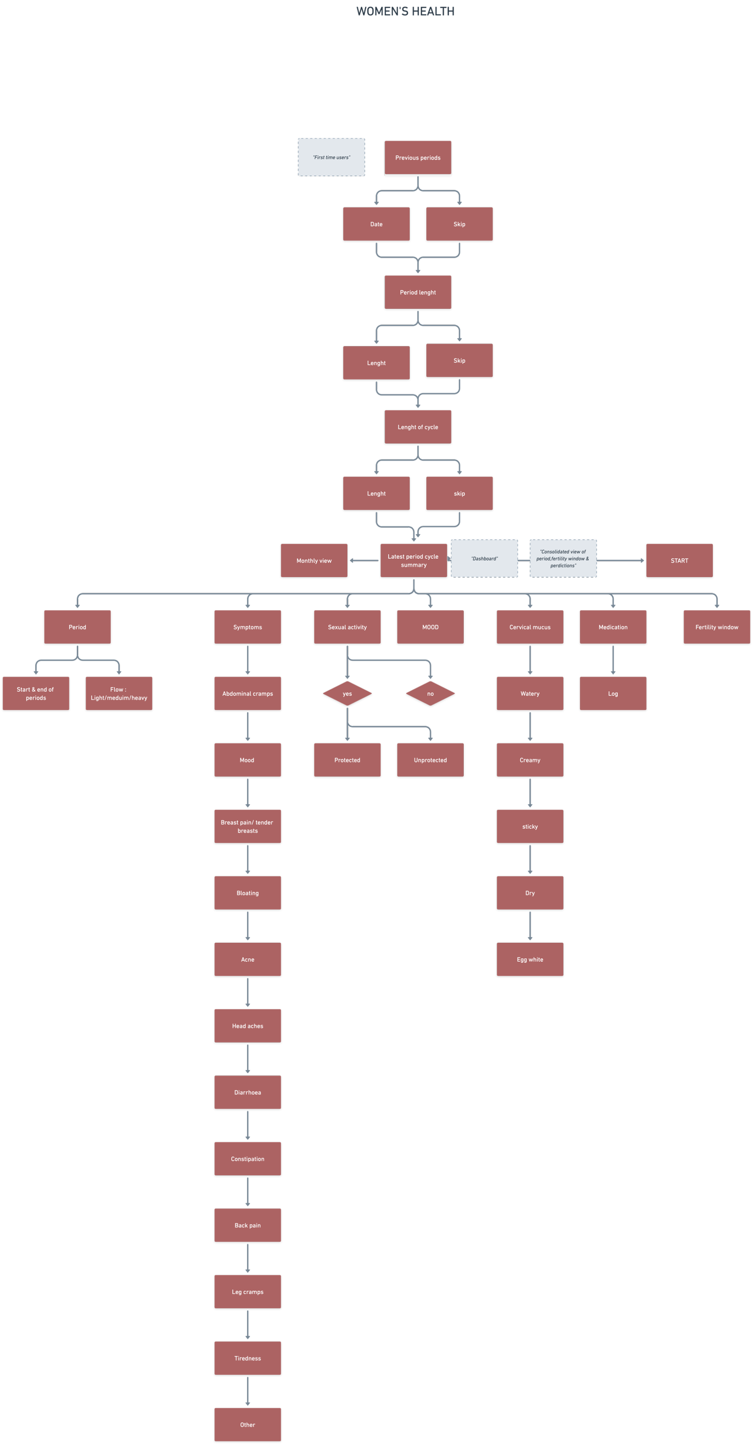
Women’s health. A whole new section, mapped from scratch.
Two rounds of testing, two clear fixes
I ran two rounds of user testing: first with low-fidelity screens, then with Figma prototypes on Loop11. A few issues made people fail tasks and spend longer figuring things out.
Prototype walkthrough. Moving through the new health screens.
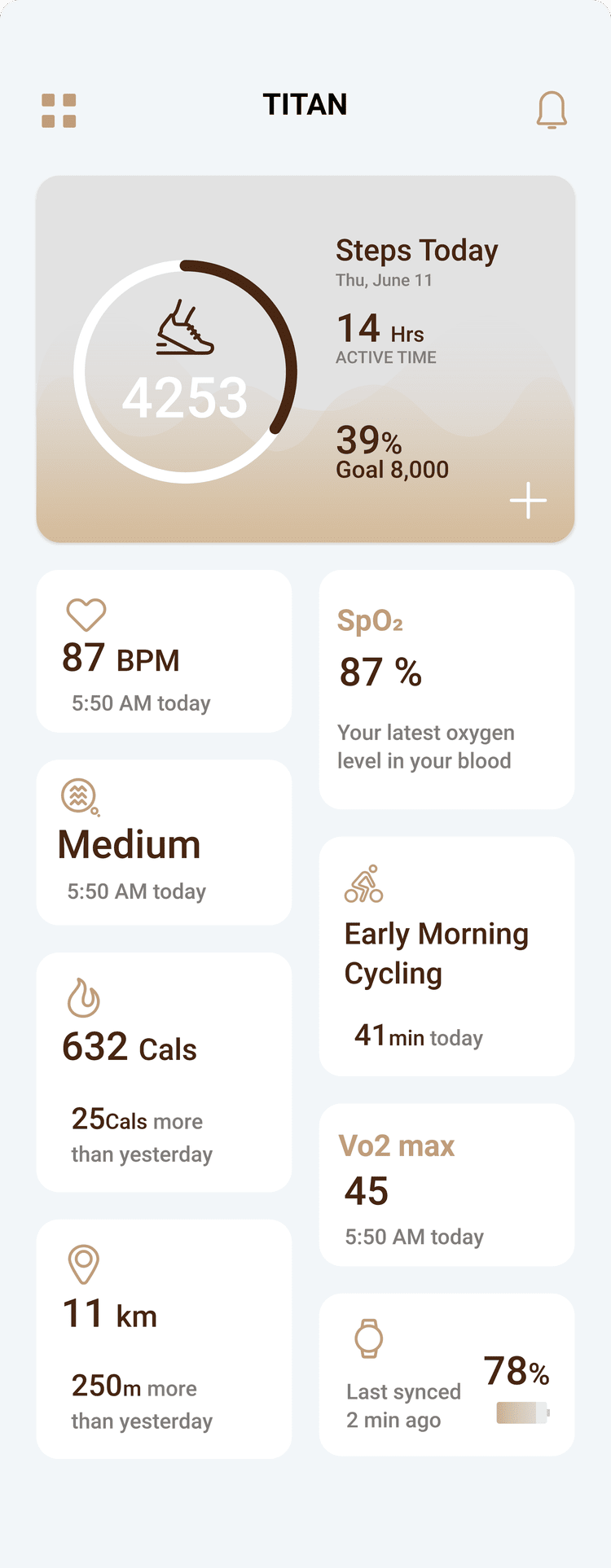
A clunky dashboard
As a fitness app, it packed a lot of features onto one screen, which felt overwhelming.
A confusing stress icon
Without a text label, the stress icon confused people in testing.
Health data you can read at a glance
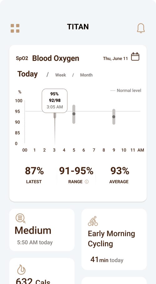
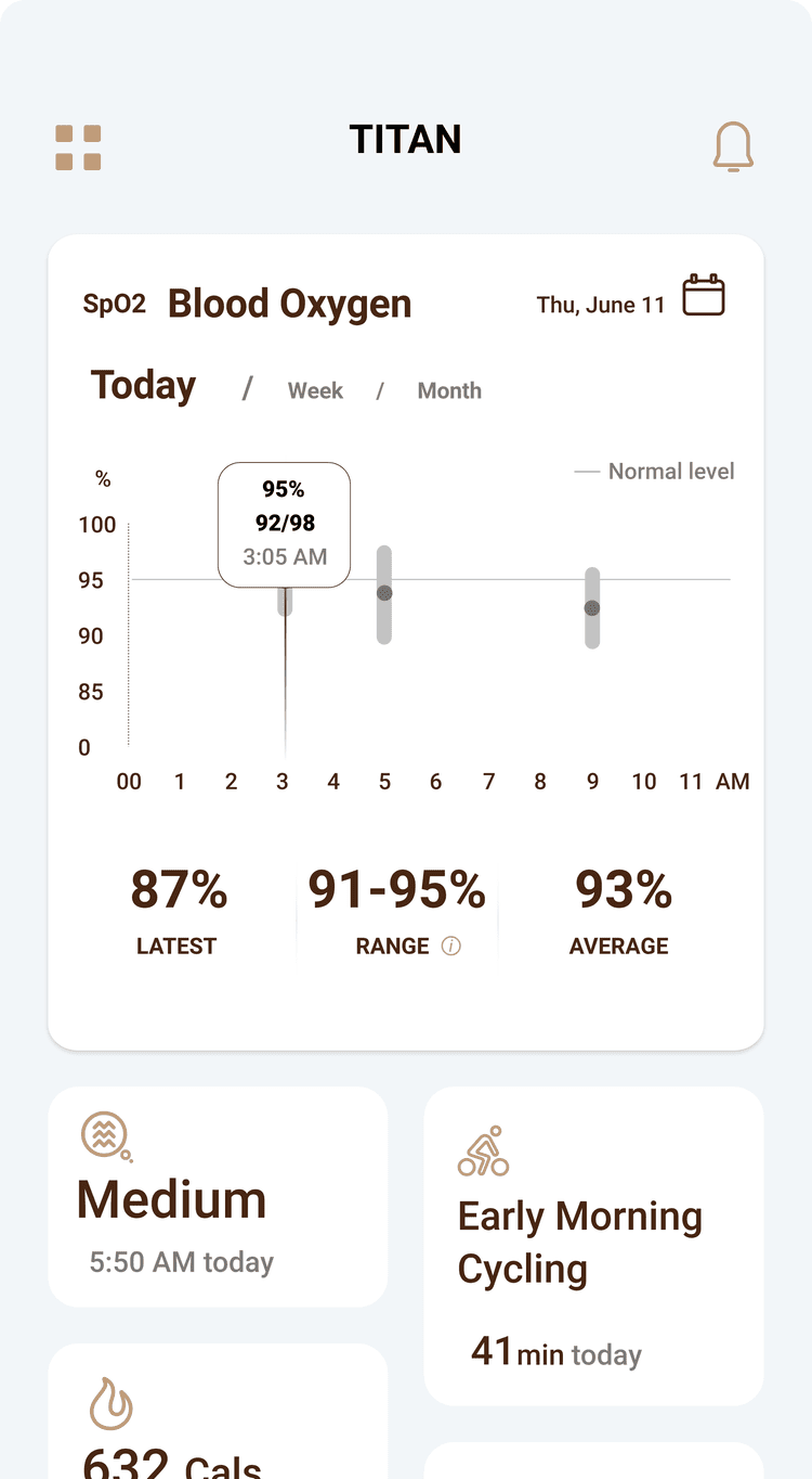
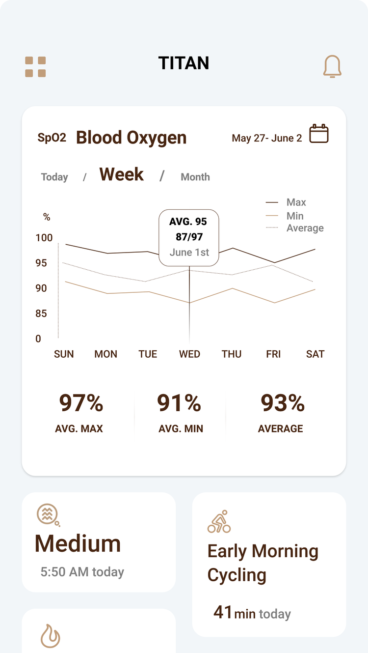
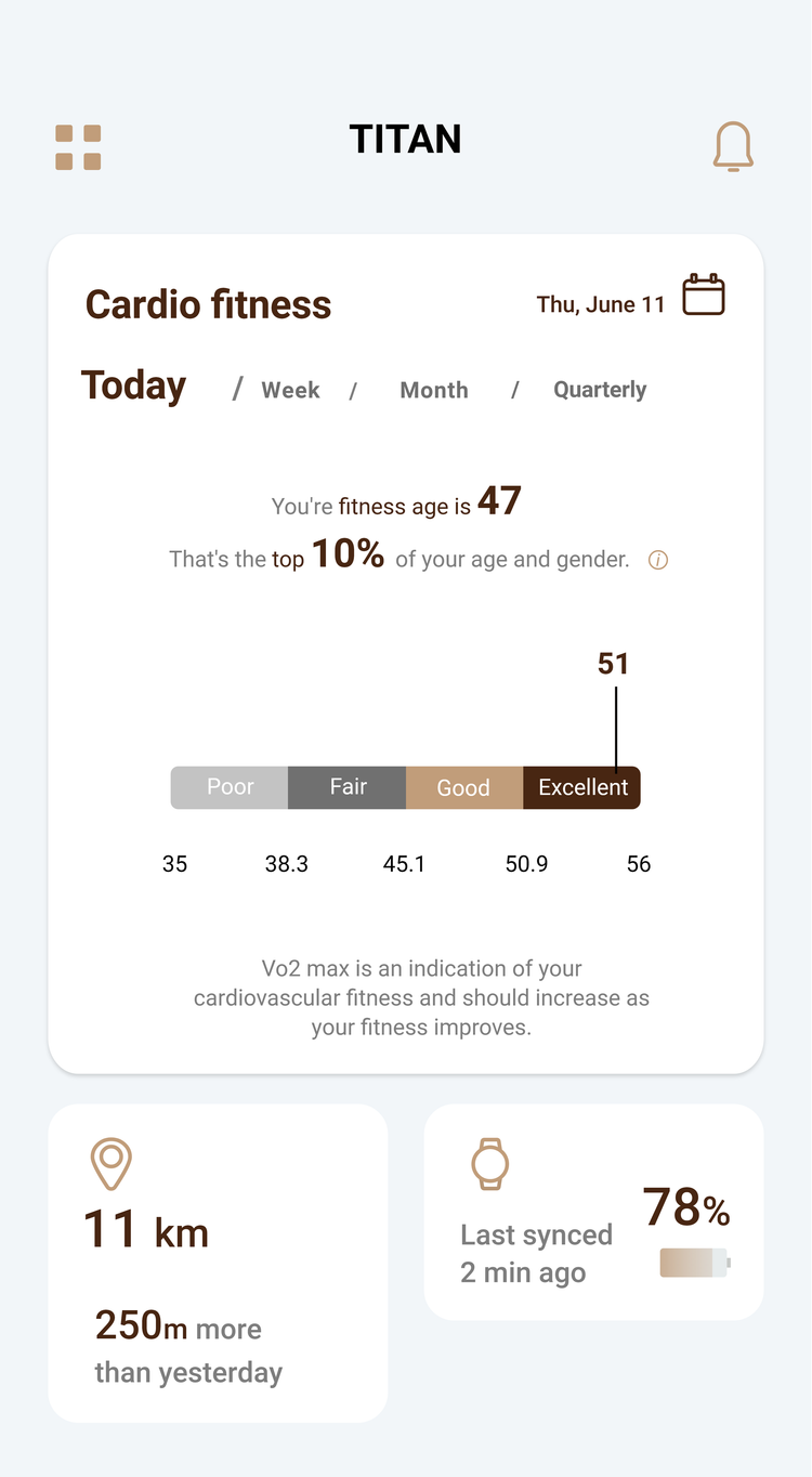
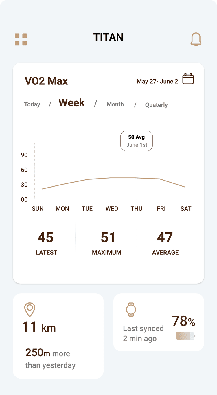
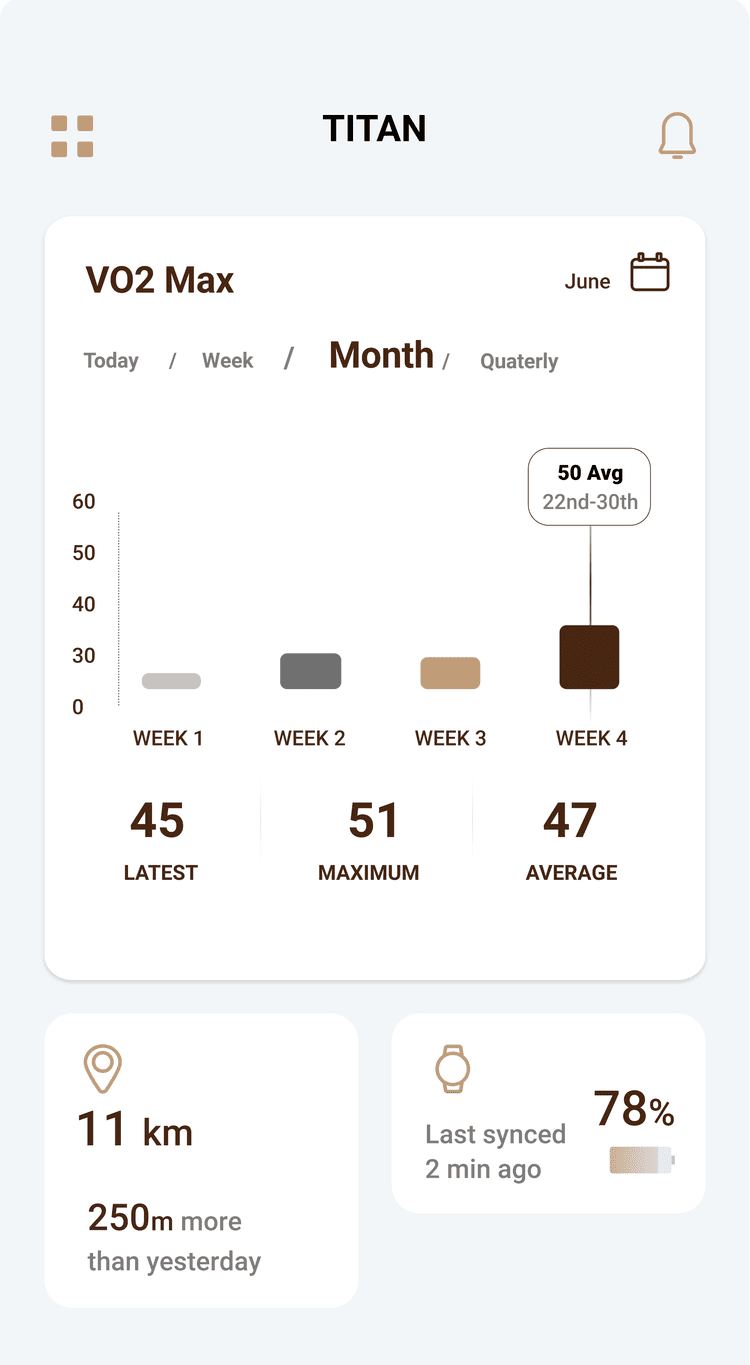
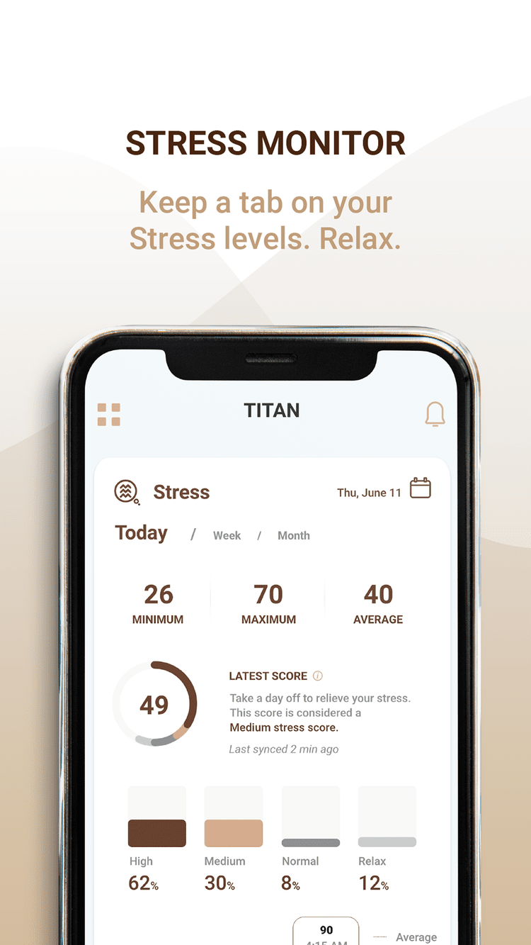
Every metric screen answers the same questions: what is this, how am I doing today, this week and this month, and what’s normal?
Blood oxygen, explained
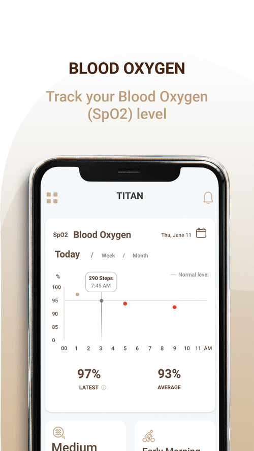
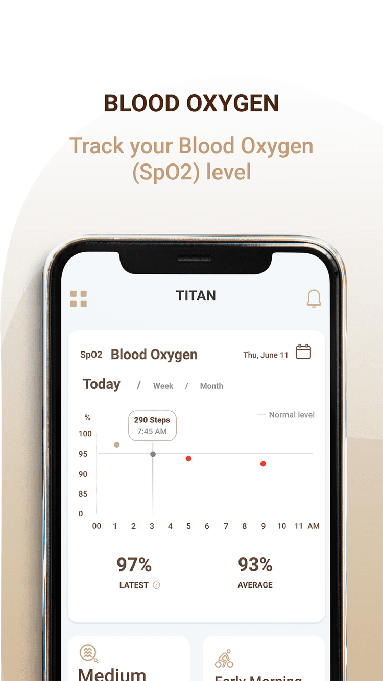
What SpO2 is, a view of the day, week or month, your latest score, average and range, and a line marking normal SpO2.
A fitness score that shows progress
What VO2 max is, a day, week or month view, and a fitness score measured over time to show progress, something that sets it apart from other apps.
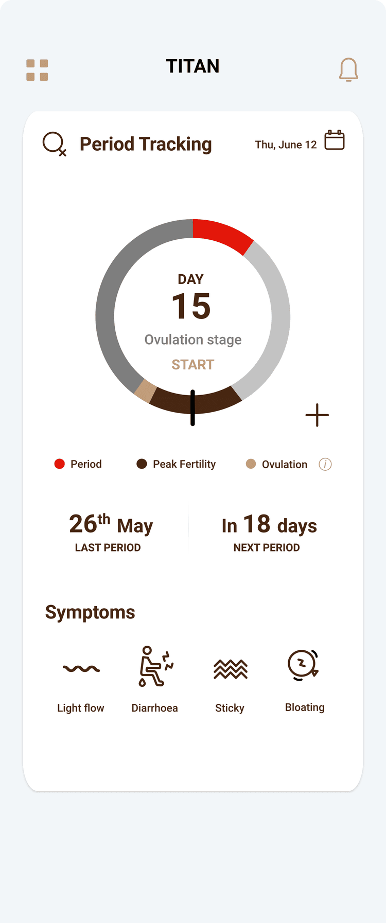
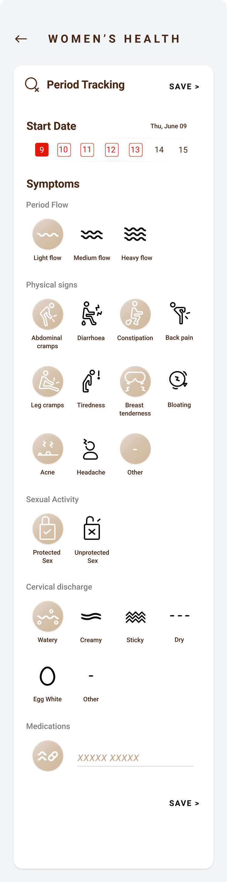
Period tracking, built in
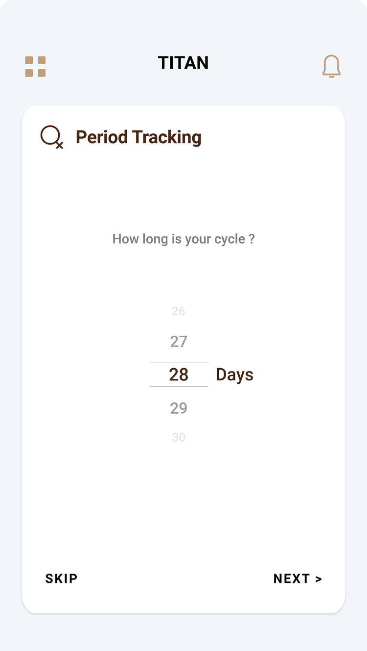
Period tracking, symptoms through the cycle, the next period, the stages of the cycle, its length and more.
Ready for launch
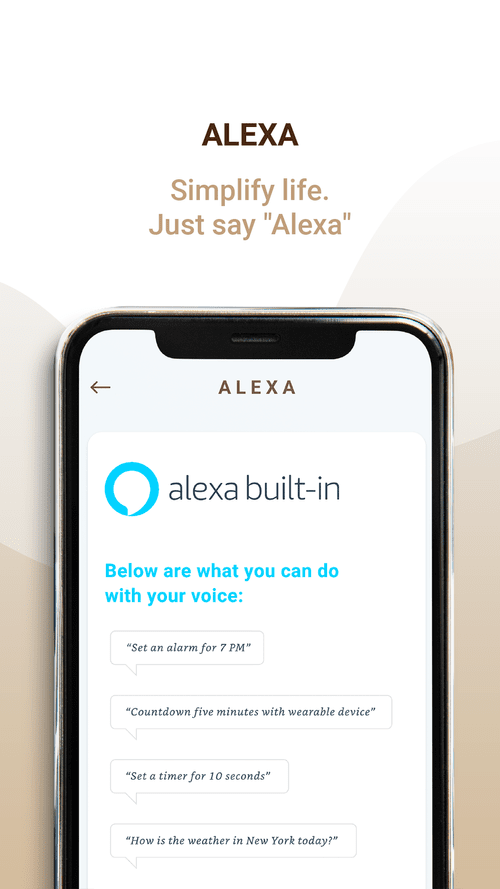
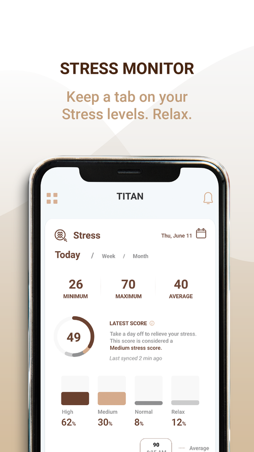
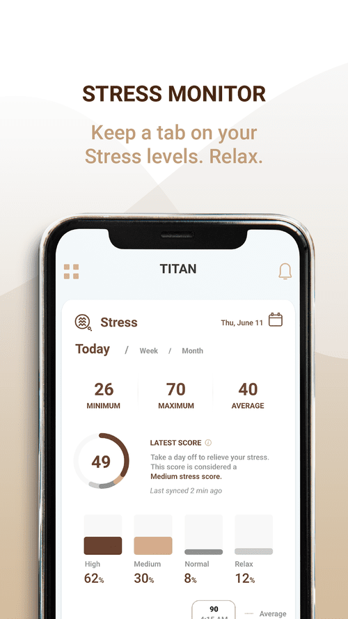
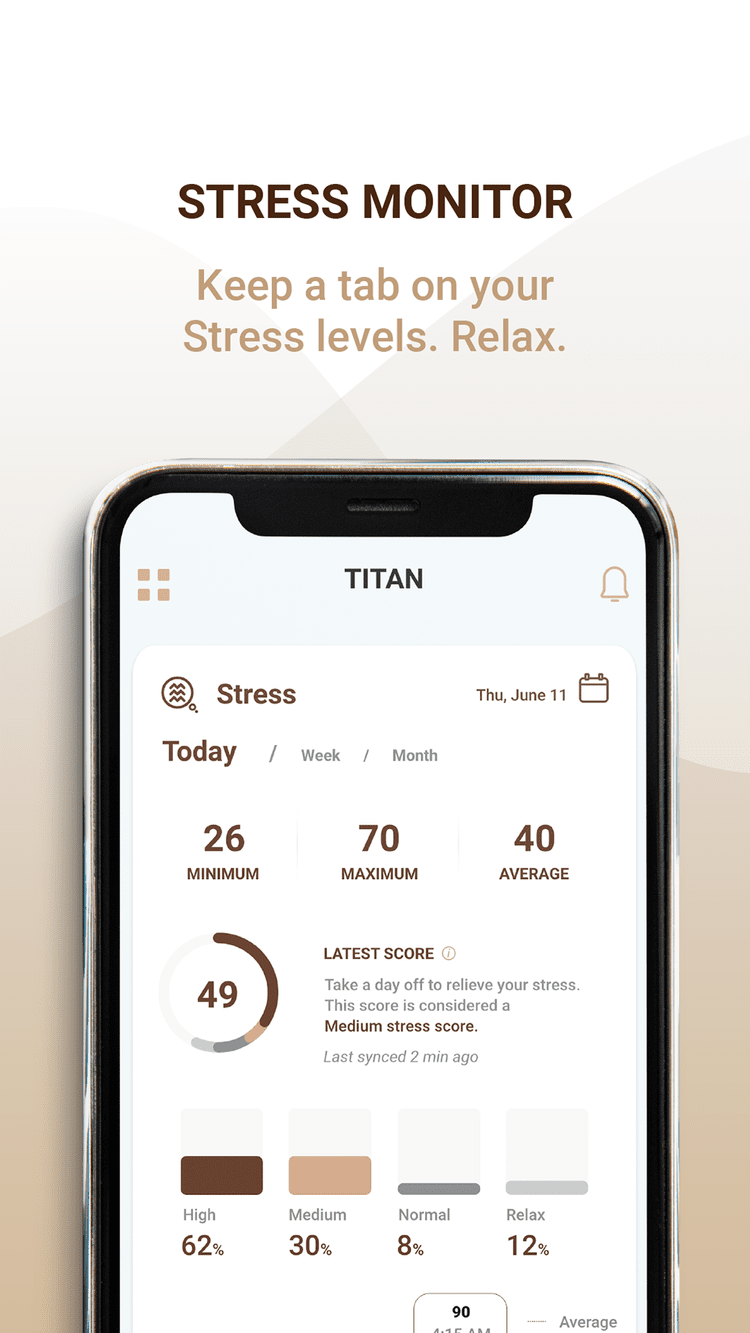
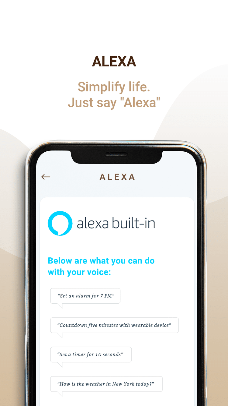
Screens that introduce the app’s headline features: stress monitoring, Alexa and blood oxygen.
Launched, and in people’s hands
Live in the market, with an increase in user satisfaction.
Changes made based on user feedback.
The full case study deck is available on request ☺
My first live project
What working on a product that shipped taught me.
A great product needs many people and teams to come together.
Be articulate with ideas, make rapid prototypes to explain concepts in meetings, and keep presentations crisp.
Some ideas sound great but add little once built. That’s where testing becomes key.
Objective
Designed the user interface and experience for new features of the Titan smartwatch application.
Overview
Context
Titan is a leading lifestyle brand in India and the fifth-largest watch manufacturer in the country. Titan was in the process of launching the first fully made-in-India smart watch.
I joined the team midway through the project. I was responsible for designing the user interface and experience for Onboarding, Spo2, Vo2 max, Stress, and Women's health sections.
The features didn’t exist before.
Success metrics
Making it efficient and increase in engagement.
Customer satisfaction and retention.
Reducing engineering costs.
Sneak peek
Before
After

The focus was to design the onboarding, Vo2 max, Spo2, and women's health section.
Information architecture
Before
Before
After
Since the features were being designed from scratch I was responsible for the user research, the creation of all the new design assets, and usability testing.

The features were fit in the existing architecture of the application.

The women’s health was a whole new section that was added to the application.
Pain points
From the user tests, I discovered the issues. These led to users failing their tasks and eventually spending more time trying to figure it out.
Select iterations

-
Since it was a fitness application there were a lot of features on one screen making it overwhelming.
-
During the user tests the users got confused by the stress icon without the text.

Launched

The main points were: what is Spo2, a visual representation of the current day | week | month, the values like the latest score | average score | range & a line indicating the normal Spo2.
Results and learnings
Working on this project reminded me how collaborative design is, and requires various people and teams to come together to create a great product.
This was my first time working on a live project and it was full of learning. I learned that as a designer, it is also important to be articulate with your ideas, create rapid prototypes for meetings where you are explaining a concept, and overall be clear and crisp with your communication and presentation skills.
I also learned that some ideas might sound great, but upon implementation, you realize it does not add much value; this is where testing becomes key.
The full case study deck is available on request. ☺
The main points were: what is Vo2 max, a visual representation of the current day | week | month, a fitness score to differentiate from other apps & measured over some time to show better results.
User testings
Final designs
Two rounds of user testing were conducted for Titan Smart. The first was with low-fidelity screens, and the second was with Figma prototypes with loop 11.
Successfully launched in the market leading to an increase in user satisfaction. With user feedback, there were some changes made.
The main points were: period tracking of women, symptoms in one’s cycles, next period cycle, different stages of the period cycle, length etc.


