Make Me Stronger Foundation
I’m the lead designer for a US nonprofit that funds bone marrow transplants. Since July 2024 I’ve turned its scattered posts into one visual language, used across social, fundraising campaigns, impact reports, events and merch.
Worked with: MMSF founders, NMDP, Horizon Blue Cross Blue Shield, THRIVE and the MMSF youth leaders.
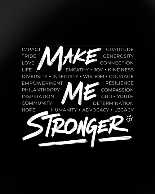
Make Me Stronger: one visual language for every way a nonprofit shows up
The challenge
Every post looked different: new fonts, colours and layouts each time. Donors, patients and partners were meeting a different foundation in every post, and a small team had to design from scratch each week.
What I did
- Kept the inherited logo and built a full system around it: colour, type, layouts and rules.
- Turned it into reusable Canva templates, one family per kind of story.
- Designed every touchpoint in it, from patient stories and impact reports to Giving Tuesday, the youth-led campaign, events and merch.
Same story format, told like it matters
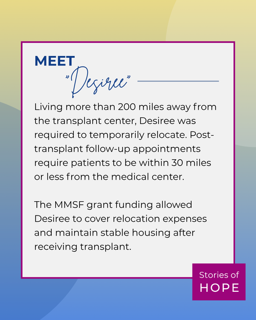
Patient stories are the heart of MMSF. Before, they were walls of all-caps text on teal. Now each one is a calm card: a name in handwriting, a short story, and the Stories of Hope tag.
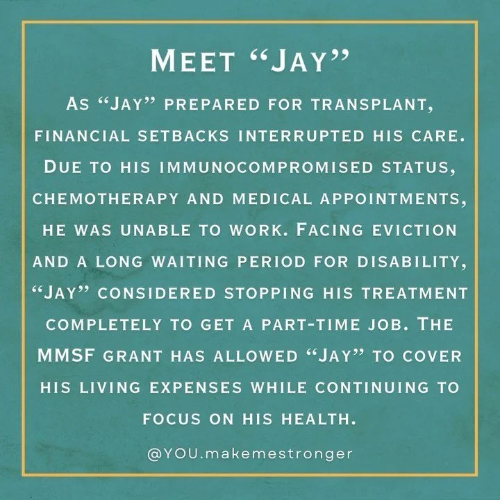
- A wall of all-caps text, hard to read on a phone
- Teal and gold that aren’t part of the brand
- No logo and no series tag
clearer,
kinder
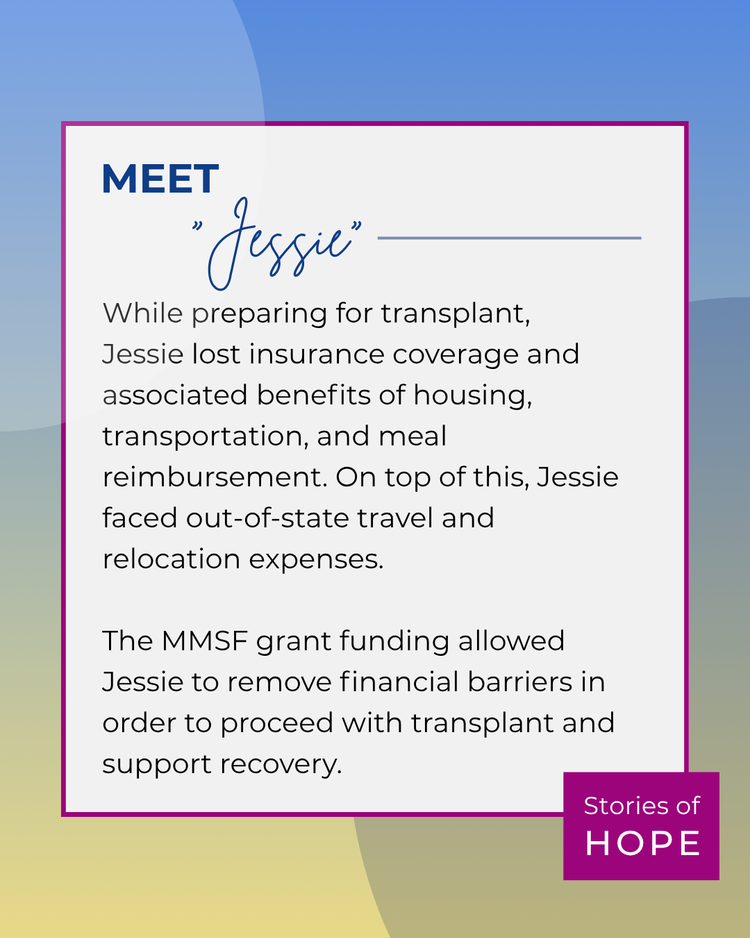
- One card, one person, one short story
- Handwritten name adds warmth, not clutter
- “Stories of Hope” tag makes it a recognisable series
An inherited logo, a whole new visual language
I didn’t redesign the logo. I built everything around it, so anything MMSF posts reads as MMSF before you see the name.
Colour
Rules I design by
- One idea per post. If it needs more, it becomes a carousel.
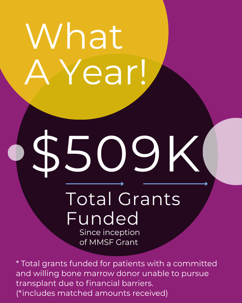
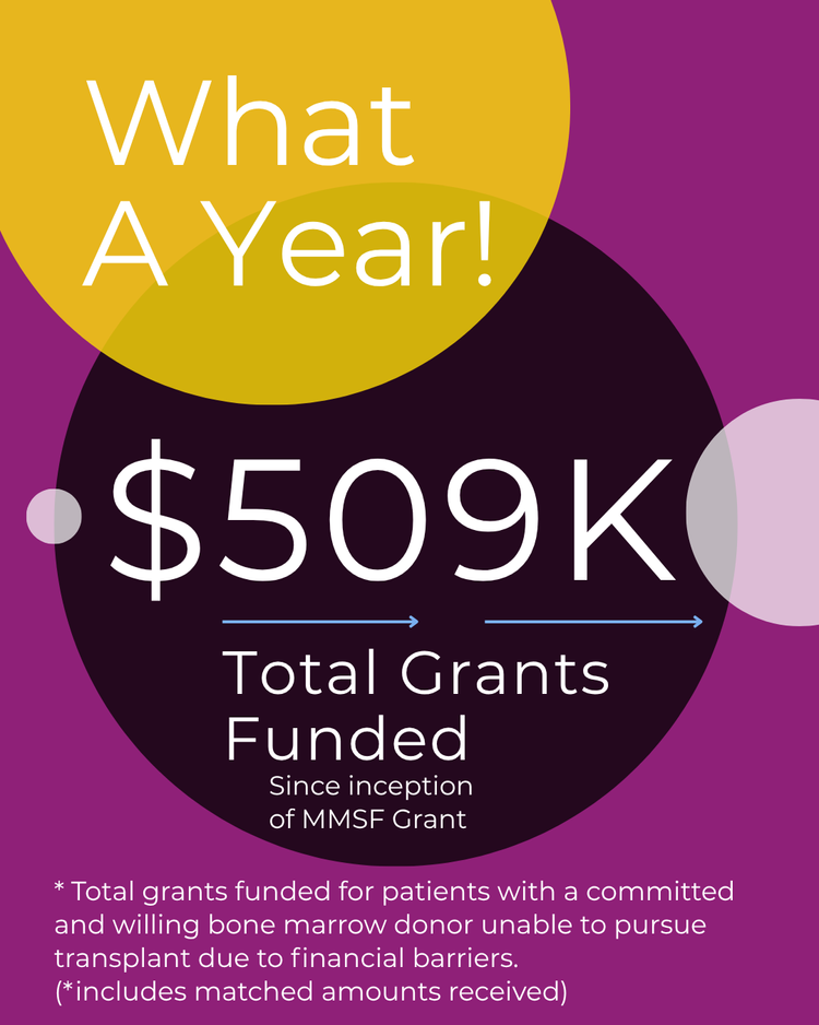
- Numbers get the biggest type. $509K should land before anything else.
- Script only for people. Names, thank-yous and campaign titles.
- Logo lock-up bottom right, always. Partner logos sit beside it, never above it.
- A template for every story type. Patients, partners, impact, events, youth.
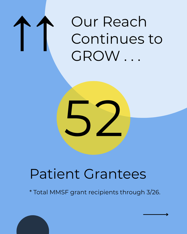
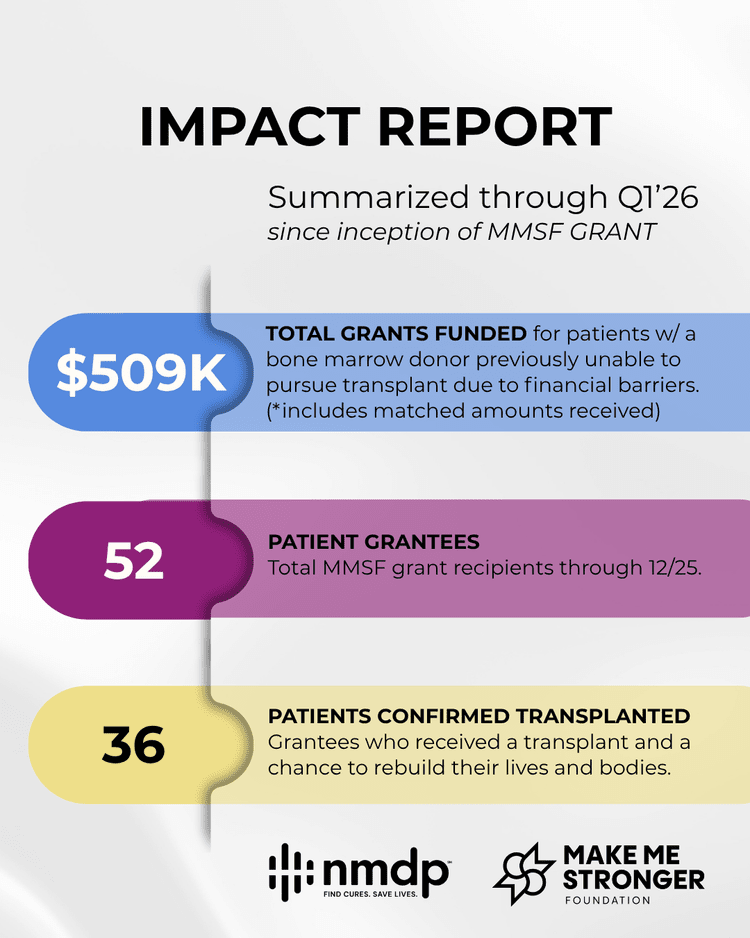
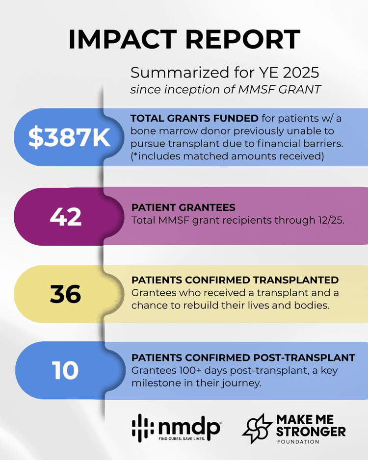
Grant data that donors can read in five seconds
Quarterly impact carousels with NMDP. Each slide carries one number, then a summary card puts it all on one page.
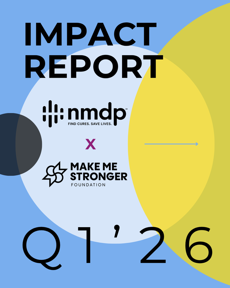
swipe it like the real carousel →
A campaign built through iteration
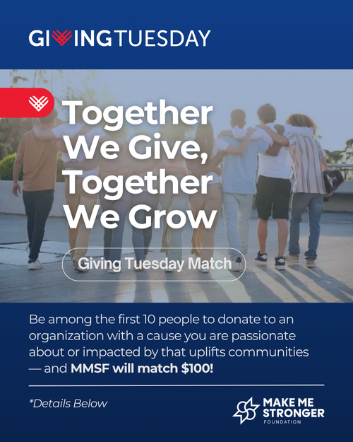
MMSF matched $100 for the first ten people who donated to a cause they care about. I explored several versions of the launch post, tuning hierarchy and how loud the match offer should be, then reused the winning layout for a follow-up post for each donor.
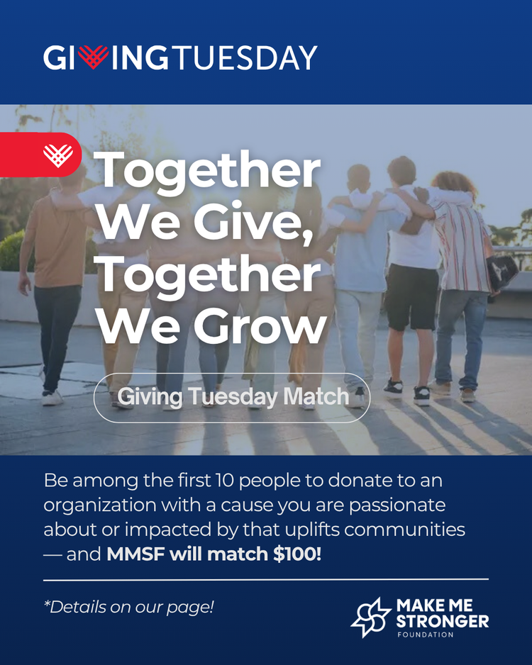
Exploration. An earlier version, still tuning copy and the call to action.
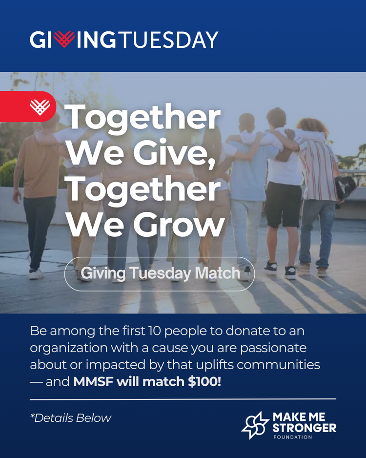
Launch post. Headline, offer and match read in order.
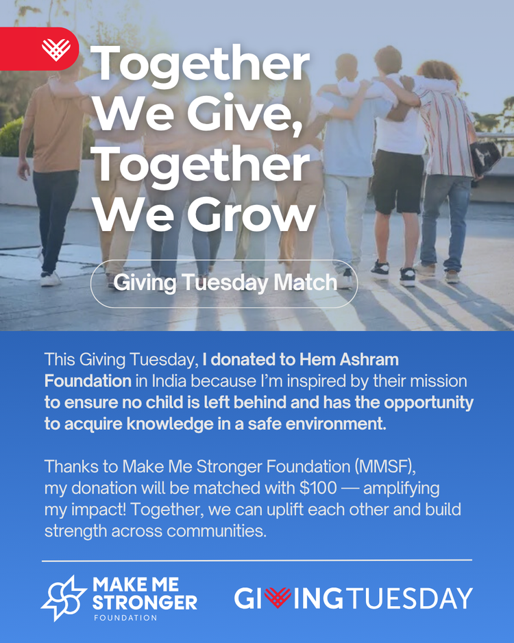
Follow-up. The same layout, reused for each donor’s story.
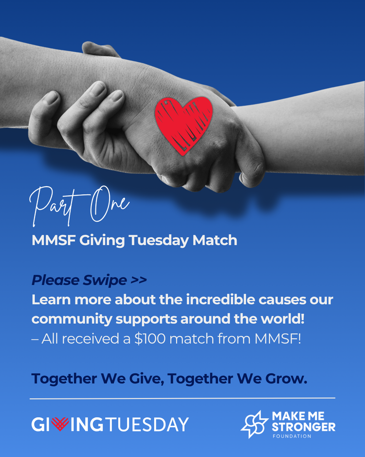
Carousel. Spotlighting the causes our community chose.
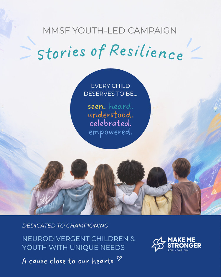
Stories of Resilience, led by teenagers
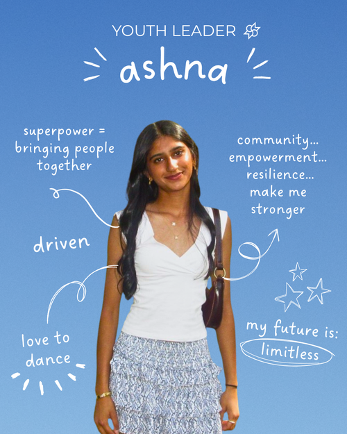
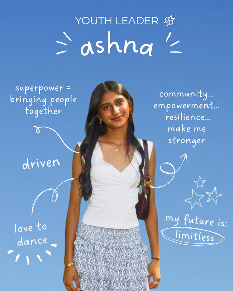
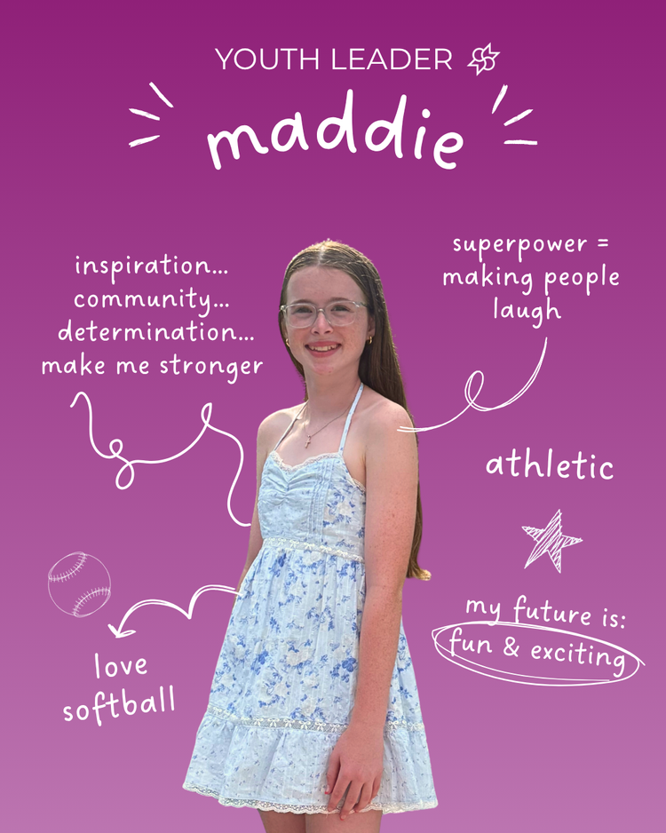
For MMSF’s youth-led campaign honouring neurodivergent children, I designed the campaign identity, its Givebutter fundraising page and a portrait series for each youth leader, with hand-drawn notes about who they are.
The same voice, off the feed
The system stretches to a merch line (a tee and a graffiti hoodie), a mission explainer, partner events and even a Spotify playlist series, so it stays recognisable wherever MMSF shows up.
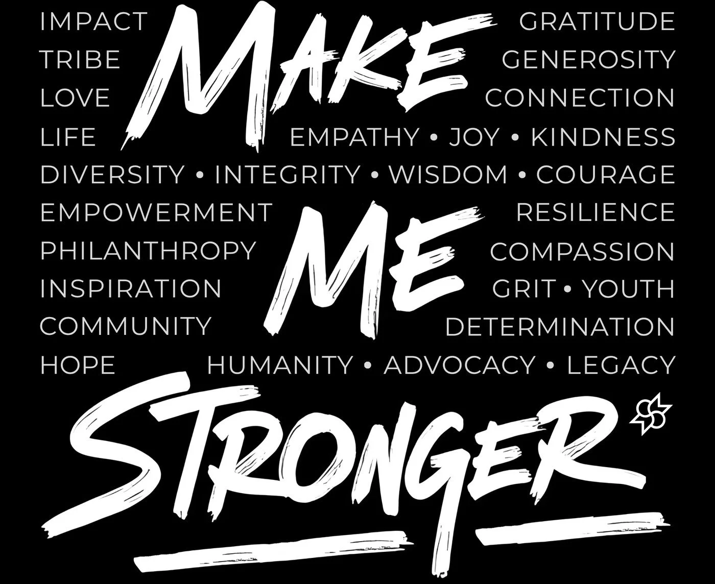
The Make Me Stronger hoodie
A black hoodie with a graffiti-style back print: “Make Me Stronger” in brush lettering, wrapped in the words the foundation stands for, from impact and tribe to hope and legacy. The logo sits small on the chest.
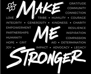
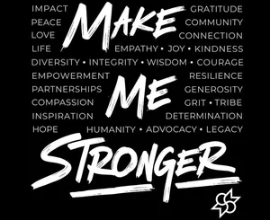
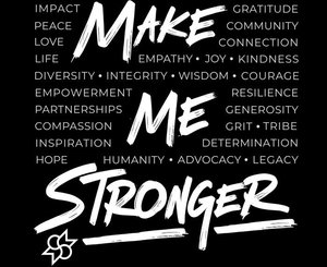
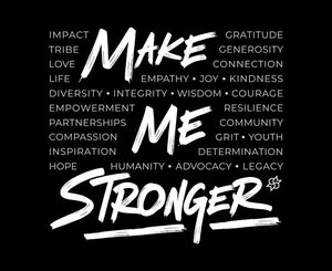
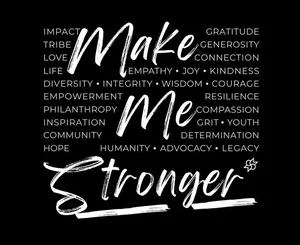
12 versions before the final: word lists, logo placement and even a script take.
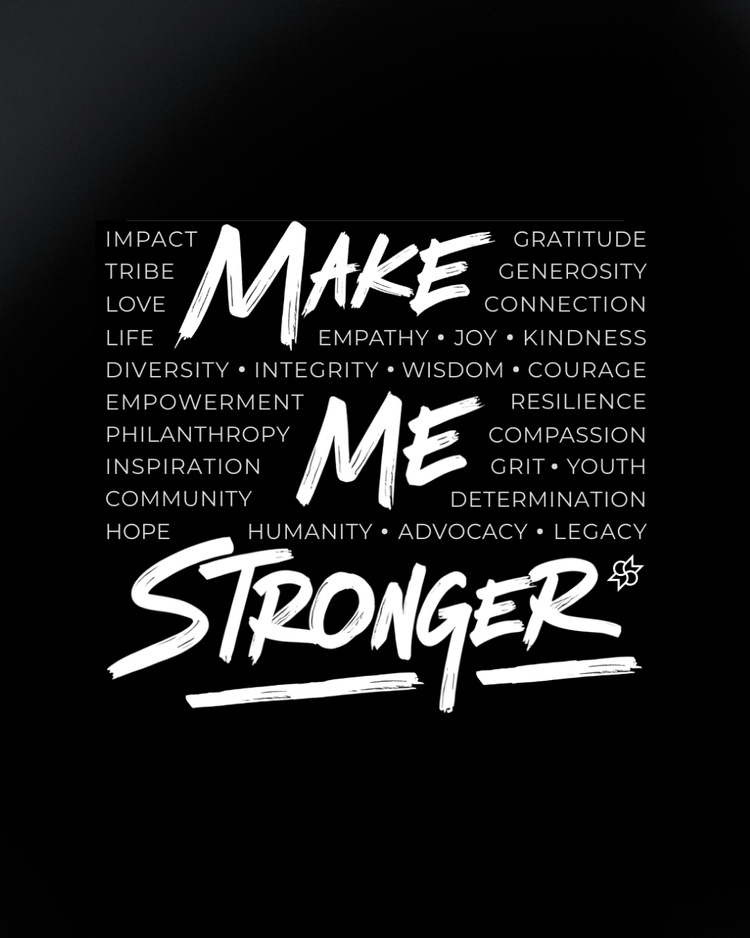
Merch. Word-cloud lettering for the MMSF tee.
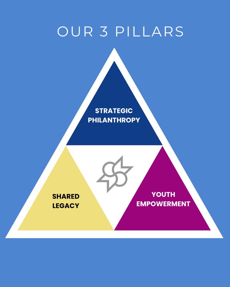
Mission. The three pillars as one shape.
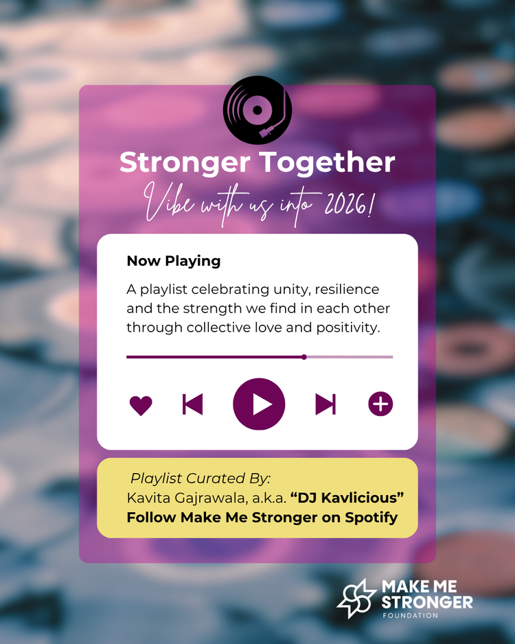
Playlist. A monthly Spotify series.
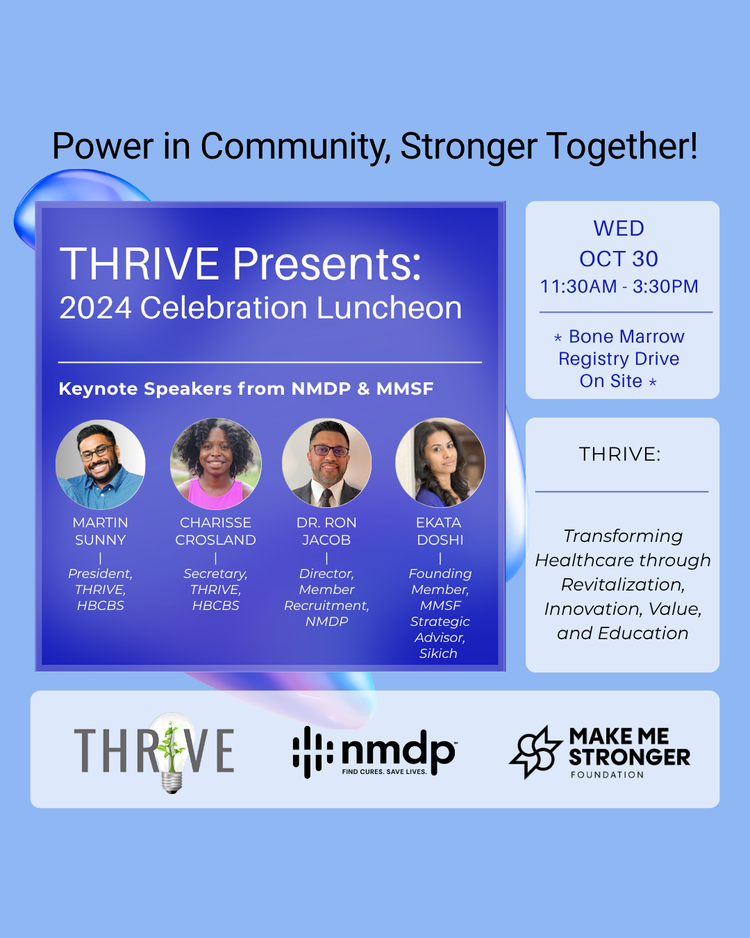
Events. THRIVE luncheon with NMDP.
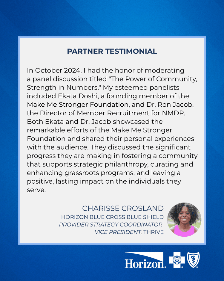
Partners. Testimonial template shared with Horizon BCBS.
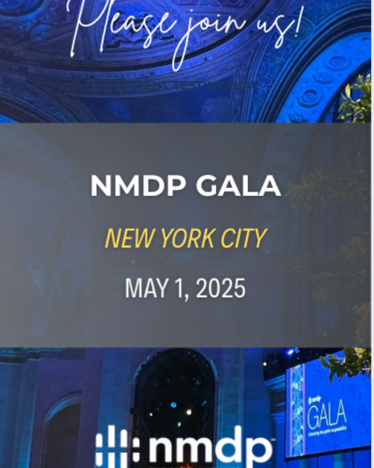
Gala. NMDP Gala invite, New York City.
The stories my designs carried
Announced through the quarterly impact carousels.
Each one told through a Stories of Hope post.
Supported by MMSF grants since inception.
Posts, stories, campaigns, reports and merch since July 2024.
Foundation-wide figures from MMSF and NMDP’s published impact reports. My role was the design that told them.
Designing for a nonprofit, week after week
Templates let a small team post often without losing quality, and let me spend time on the moments that matter.
Patient stories use first names and calm layouts. The design should never feel louder than the person.
Keeping the inherited logo and building around it moved faster and earned trust with the founders.
The MMSF website rebrand
Next up: taking the same system to the foundation’s website.